1.3 Case Study for Using the DttG database – Grey over Red Double Grounds
Among the most distinctive and revealing ground types in the Down to the Ground database is the grey over red double ground. This stratigraphy, comprising a lower red or reddish-brown earth layer topped with a second, lead-white-based grey, appears in Haarlem and Utrecht from the last decade of the sixteenth century. The earliest examples include Cornelis Cornelisz van Haarlem and a cluster around Abraham Bloemaert and his peers Joachim Wtewael and Paulus Moreelse, and later among the Utrecht Caravaggisti, whose paintings reveal an increasing reliance on this structure.1 Joseph and his Brothers by Abraham Bloemaert (Figure 1.7) is an early and representative painting using this ground type, which can be seen in a cross-section (Figure 1.8).2
The familiarity of later researchers with the ground types defined by earlier studies has often reinforced certain assumptions without sufficient contextualisation. A key example is the influential work of Karin Groen, whose analysis of Rembrandt and his Amsterdam contemporaries identified a recurrent grey over red double ground.3 This finding long shaped the view that such a stratigraphy was characteristic of Amsterdam practice. Yet this association arose largely from the limited geographical scope of the data considered at the time. The broader evidence now gathered in the DttG database reveals a different chronology: grey over red double grounds appear first in Utrecht and Haarlem around 1590, gaining particular prominence in Utrecht workshops during the first decades of the seventeenth century. Only by the 1620s does this structure begin to appear in Amsterdam. When the DttG data is filtered by date (1600–1650), support (canvas), and colour sequence (red + grey), the pattern of diffusion becomes clear. Figure 1.9 shows Utrecht examples dominating the early decades, with Amsterdam following in the 1620s-30s Utrecht thus emerges as an early centre of technical innovation.4
Some scholars have suggested that the grey-over-red structure may have been chosen for its optical or colouristic effect. Groen, for example, cites an anonymous eighteenth-century source that claims the combination of a red lower layer and a grey upper layer was intended to achieve a desirable “reddish grey” tone.5 Yet as Maartje Stols-Witlox has shown, the author of that source–Nieuwen Verlichter der Konst-schilders, vernissers, vergulders en marmelaers (1777)–was in fact describing a grey layer that already contained red pigment, rather than a layered grey over red double ground.6 Ernst van de Wetering also observed that the opacity of the lead-white-rich grey layer would prevent any perceptible influence from the red ground below.7 This conclusion has since been confirmed through practical reconstruction experiments carried out by Laura Levine in collaboration with Stols-Witlox and the Down to the Ground project, which demonstrated that the underlying red layer does not significantly alter the hue of the grey surface.8 The so-called “reddish grey” effect therefore appears to result from pigment composition and optical perception rather than from deliberate stratigraphic colour design.
It is more likely that grey over red grounds, and particularly red first grounds, which were also often used with light brown second grounds, were chosen for economic reasons. Van de Wetering proposed this in Rembrandt: The Painter at Work, citing the relative cheapness of earth and ochre pigments in comparison to lead white.9 To save on costs, it would make sense to fill the structure of the canvas with an inexpensive material which could be subsequently covered by a thin layer of the more costly lead white.10 Stols-Witlox’s reconstructions also confirm the economic advantage of this structure: substituting earth pigments for part of the lead-white mass yields measurable cost savings while maintaining a workable, visually coherent surface.11
Returning to the database, we see these ideas confirmed across a broad sample of paintings. Of the 834 paintings currently in the database, 142 have grey over red double grounds and 193 have double grounds with a red first ground.12 However, there are only 33 paintings with a red uppermost ground, indicating that painters did not regularly choose this colour to paint on. In contrast, the database has 281 paintings with a grey uppermost ground (including single grounds). Indeed, light grey was the most popular ground colour to work on during this period, as shown in Figure 1.2. These results support the idea that the lower layer of a double ground was chosen for structural and economic rather than optical reasons.
The grey-over-red double ground provides a particularly revealing lens through which to examine artistic decision-making and knowledge transfer. As briefly described here, its dual structure encapsulates two of the main motivations for Netherlandish artists to adopt coloured grounds: economic consideration and aesthetic ambition. It reflects both the pragmatic demands of a growing art market and an evolving understanding of how colour, tone, and material structure could interact to shape pictorial effect. In this sense, it exemplifies the kind of phenomenon that the DttG database is designed to uncover—patterns of shared practice that become visible only when technical evidence is aggregated across collections and time.

Figure 1.7:
Abraham Bloemaert
Jozef ontvangt zijn broers in Egypte (Genesis 44:14), ca. 1595-1600
Utrecht, Centraal Museum, inv./cat.nr. 8289
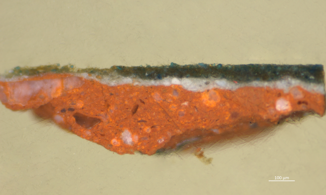
Figure 1.8: Cross-section (A306-2, 100x magnification, dark field) of Abraham Bloemaert, Joseph and his Brothers, ca. 1595–1600, oil on canvas, 141.3 x 211 cm, Centraal Museum, Utrecht. Photographed by Moorea Hall-Aquitania.
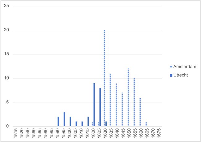
Figure 1.9: Grey over red grounds in Utrecht and Amsterdam (Figure adapted from M. Hall-Aquitania, “Common Grounds: The Development, Spread, and Popularity of Coloured Grounds in the Netherlands 1500–1650” [PhD diss., University of Amsterdam, 2025], fig. 1-7.)
Notes
1 See Chapter 5 of Hall-Aquitania, 179–227.
2 Cross-section of Abraham Bloemaert, Joseph and his Brothers, ca. 1595–1600, oil on canvas, 141.3 x 211 cm, Centraal Museum, Utrecht. Cross-section taken by J.R.J. van Asperen de Boer (RKD Van Asperen de boer archive) and photographed by Moorea Hall-Aquitania.
3 Groen, “Grounds in Rembrandt’s Workshop.”
4 While painters such as Cornelis Cornelisz. van Haarlem and Cornelis Ketel also employed grey over red grounds around 1590, there is no evidence of comparable continuity or knowledge exchange in these cities. This may, however, reflect the scarcity of technical data for this early period, particularly in Amsterdam. See Hall-Aquitania, “Common Grounds,” 179–227.
5 Groen, “Grounds in Rembrandt’s Workshop,” 320.
6 Stols-Witlox and d’Hont, “Remaking Colored Grounds,” 16.
7 Ernst van de Wetering, Rembrandt: The Painter at Work, Revised edition (Oakland: University of California Press, 2018), 131.
8 Levine, “Lead Soaps in 17th Century Grey on Red Double-Ground Systems in Northwestern Europe.”Stols-Witlox and d’Hont, “Remaking Colored Grounds.”
9 Van de Wetering, Rembrandt: The Painter at Work, 131.
10 For a discussion of the relative costs of pigments as well as the physical structure of earth-based ground layers, see Hall-Aquitania, “Common Grounds,” 119–27.
11 Stols-Witlox and d’Hont, “Remaking Colored Grounds.”
12 “Red and orange lowermost grounds” and “grey uppermost ground” selected in advanced search. Red earth-based ground layers often appear orange in cross-sections due to lighting and the presence of red lead or lead soaps, which is why the orange category is included.